
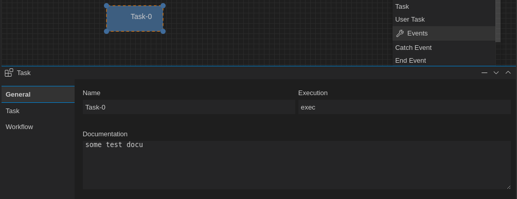
The BPMN Properties Panel
Open-BPMN provides a property panel within the diagram plane to be used to edit and update BPMN Element properties.
JSONForms
The bpmn-property-panel.tsx is implementing a SelectionListener to display the properties of a selected BPMN element.
The input form which contains the different input elements is based on JsonForms. JsonForms expects three JSON schemata to describe the data elements and types:
- data - holds the values of the data items
- schema - describes the type of the data items
- uischema - contains layout information
The schemata is generated server side by the corresponding BPMN Extension by implementing the method buildPropertiesForm
@Override
public void buildPropertiesForm(final BPMNBaseElement bpmnElement, final DataBuilder dataBuilder,
        final SchemaBuilder schemaBuilder, final UISchemaBuilder uiSchemaBuilder) {
        ....
}
Action Events
The BPMN Property Panel reacts and produces different Action events to updated data in both directions.
The SelectionListener
Mainly on the BPMN PropertyPanel reacts on the GLSP SelectionChanged event. If the selection changed and onyl one BPMN Element was selected In this case the panel refreshes the content for the Form Panel with the UISchema and Data provided by the selected element. Each BPMN Element provides the following arguments holding the corresponding JsonForms schema:
- JSONFormsData - the data holding key/value pairs
- JSONFormsSchema - the data schema
- JSONFormsUISchema - the UI schema
In addition the panel also computes the last selected category. This is used in the setState method to restore the last category if the element type has not changed.
The BPMNPropertiesToggleAction
The BPMNPropertiesToggleAction is a custom action used by Open-BPMN to toggle the display state of the Property Panel. The panel either expands tis height to 50% or minimizes the panel. This is a client side action event triggered by custom menu commands defined for the Theia and VSCode integration.
The BPMNPropertiesApplyOperation
The BPMNPropertiesApplyOperation is a client side custom operation, that is send from the client to the server to apply new values to the BPMN model. The operation is send each time the data in an input field changed (onchange).
The operation is handled on the server by the BPMNPropertiesApplyOperationHandler which is responsible for updating the model representation accordingly.
The operation is providing the Element ID, a JSON data structure with the new/updated data and an optional category. The category can be used to update only parts on an BPMN element. This is to optimize the update performance as the data structure can become very complex or various BPMN elements.
The update process is handled by the Extension Mechanism in a transparent way.
The BPMNPropertiesUpdateAction
In some cases the BPMNPropertiesApplyOperationHandler causes on the server side a more complex data update that requires an update of the property panel on the client side too. For example adding a new Signal or Diagram Definition is such a situation where the property panel need to be updated on the client side.
In this cases the server sends a BPMNPropertiesUpdateAction to the client. The BPMN Property Panel reacts on this kind of action and updates the panel content.
Custom Renderer SelectItemControl
Most of the data to be displayed can be handled by JsonForms out of the box, so we only need to provide the corresponding schemata. But in some cases - e.g. the SignalEvent option or the Imixs-Workflow extensions - the corresponding input form is more complex. For this we implement a custom renderer to provide an optimized input form.
The SelectItemControl is a custom renderer for selectItems represented as RadioButtons, CheckBoxes or ComboBoxes.
The control can handle single String values (represented as a Radio Button or ComboBox) or Arrays of Strings (represented as Checkboxes).
In addition the renderer support label|value pairs separated by a | char.
My Value | val-1
This allows to separate the label and data value in one string.
In addition the layout for Checkboxes and RadioButtons can be customized by the option orientation=horizontal|vertical.
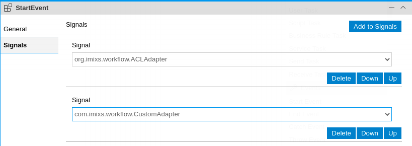
Even the user can select the option by the name, internally the value will be mapped to the id.
UI Schema
To set the UISchema using a radio button:
      Map<String, String> selectVertical = new HashMap<>();
      selectVertical.put("format", "selectitem");
      selectVertical.put("orientation", "vertical");
	  uiSchemaBuilder //
                    .addElement("keyownershipfields", "Owner", selectVertical)
To set the UISchema using a comboBox:
      Map<String, String> selectVertical = new HashMap<>();
      selectVertical.put("format", "selectitemcombo");
	  uiSchemaBuilder //
                    .addElement("keyownershipfields", "Owner", selectVertical)
Schema
The schema defines the option list as label | value pairs
	String[] enabledOption = { "Yes|true", "No|false" };
	schemaBuilder.addProperty("myitem", "string", "", enabledOption);
Data
The data can be either a single string displayed as a radio-button or comboBox. Or a String Array displayed as check-boxes.
 	dataBuilder //
			.addData("keyupdateacl",mystringValue) //
			.addDataList("keyownershipfields",myValueList)) //